House Price Ireland now covers more than headline sold prices. Use county maps, rankings, and premium charts to compare value, payment pressure, tax drag, momentum, and where counties sit against longer market cycles.
Use rankings, maps, and county pages to move from a national view to a local view without losing context.
Price-only stories are incomplete. You can now follow yearly, five-year, month-on-month, and June 2022 anchored change views alongside sales activity.
See which counties look expensive against income, where mortgage pressure is heavier, and where value still looks more reasonable.
Start with the free maps and rankings, then move into county compare, buyer score, cap rate, and valuation tools when you want more depth.
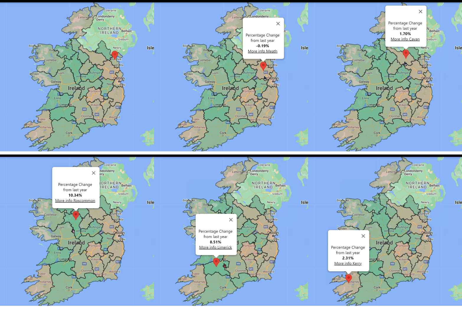
Start with the Ireland map to see sold prices, yearly movement, sales count, and county position versus the national average before moving into the newer premium map layers.
Explore the sold price map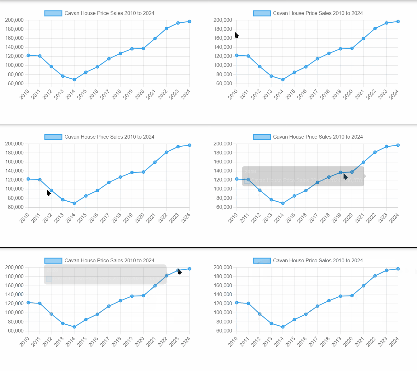
Use county rankings and chart pages to see where prices are highest, where momentum is strongest, which counties have held up best over time, and where conditions are changing fastest.
Explore county rankings
Each county page includes summary cards, sales charts, county-vs-national comparison, and direct routes into premium maps and charts for deeper local analysis.
Explore a county pageThe site works best when you move through it in layers: start with the map, check the rankings, then drill into county pages and compare tools when you need to understand whether one market is stronger, more active, or still better value than another.
Check which counties are still below the national average, where momentum is cooling, and how far payment pressure and value-to-income ratios have stretched.
Check affordability pressureSee whether your county is holding strong against the rest of Ireland, whether demand still looks active, and whether short-run growth is still on your side.
See current momentumUse county pages, rankings, cap-rate views, and valuation tools to move beyond anecdotes and compare income, rent proxy, tax, and price pressure together.
Review investment yieldRecent additions fill in the questions buyers and investors usually ask after looking at the basic price map: can locals still afford the market, does a county look stretched, how much did values move in the short run, and how far has each market recovered from the recession era.
Use value to income, salary to afford a house, mortgage payment share of income, and property tax rate views to gauge real purchase pressure.
Explore affordability chartsCheck over or under valued counties, buy versus rent pressure, and the blended buyer score when comparing where value still looks defensible.
Explore valuation viewsFollow five-year growth, month-on-month change, June 2022 change, and recession-era crash context to separate one-month noise from bigger market shifts.
Explore trend chartsExplore sold-price series, local sales and planning datasets for your own product or research. Inspect real JSON data and talk to us about API access.
See practical uses, the Starter plan and how access works.
View the Property Data APISearch the catalogue by area or category and inspect file sizes.
Find your datasetAsk about coverage and integration without creating an account.
Discuss your projectThe public site gives you the map, rankings, county pages, and market context. Premium is where the higher-value workflows live, especially county compare plus deeper affordability, valuation, momentum, and investor-focused pages.